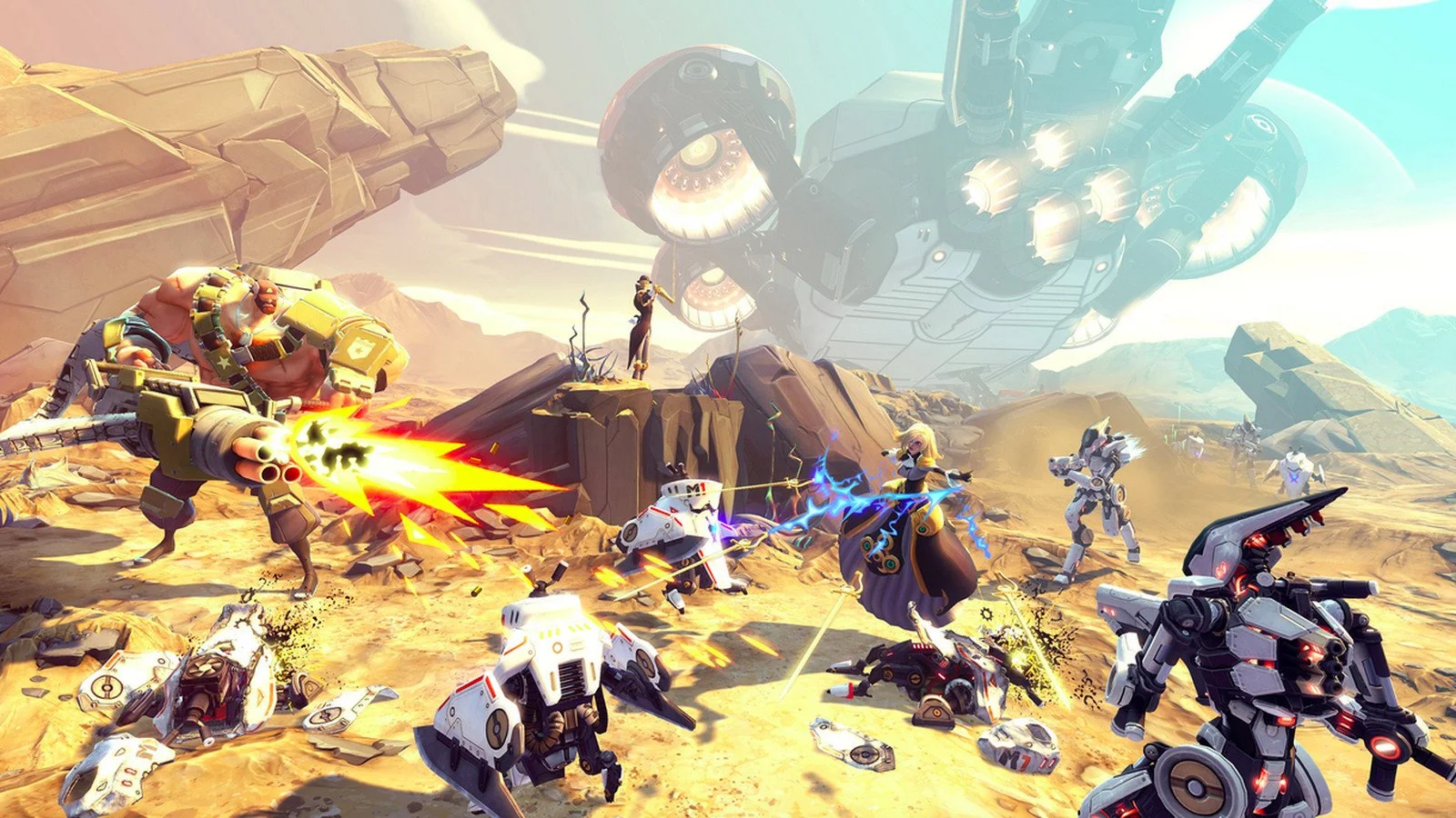
BATTLEBORN
Gearbox Software - 2015 to 2016
Genre - Multiplayer Competitive Shooter
Role - Level Designer
Responsibilities - Level Design, Materials, Visual Effects
LEVEL ART AND DESIGN
As Battleborn was nearing ship, there were several levels that we still in the block-out phase and needed art passes. I really enjoy working on the final stages of a project when my contribution can have the biggest impact on the shipping game.
EPISODE 7
THE SABOTEUR
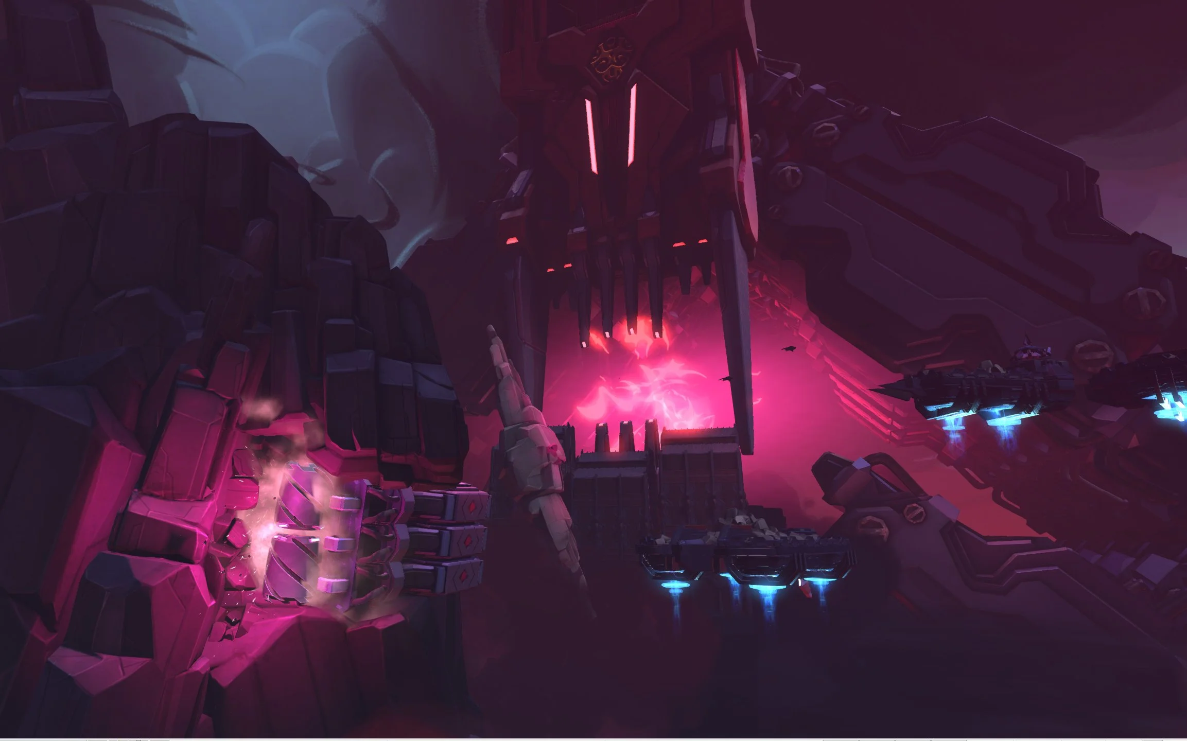
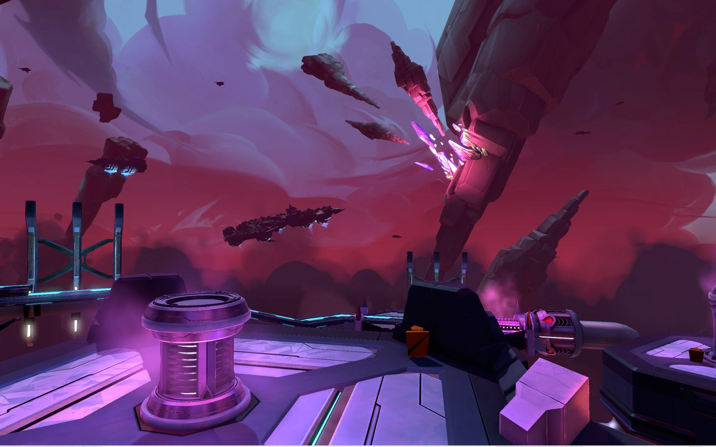
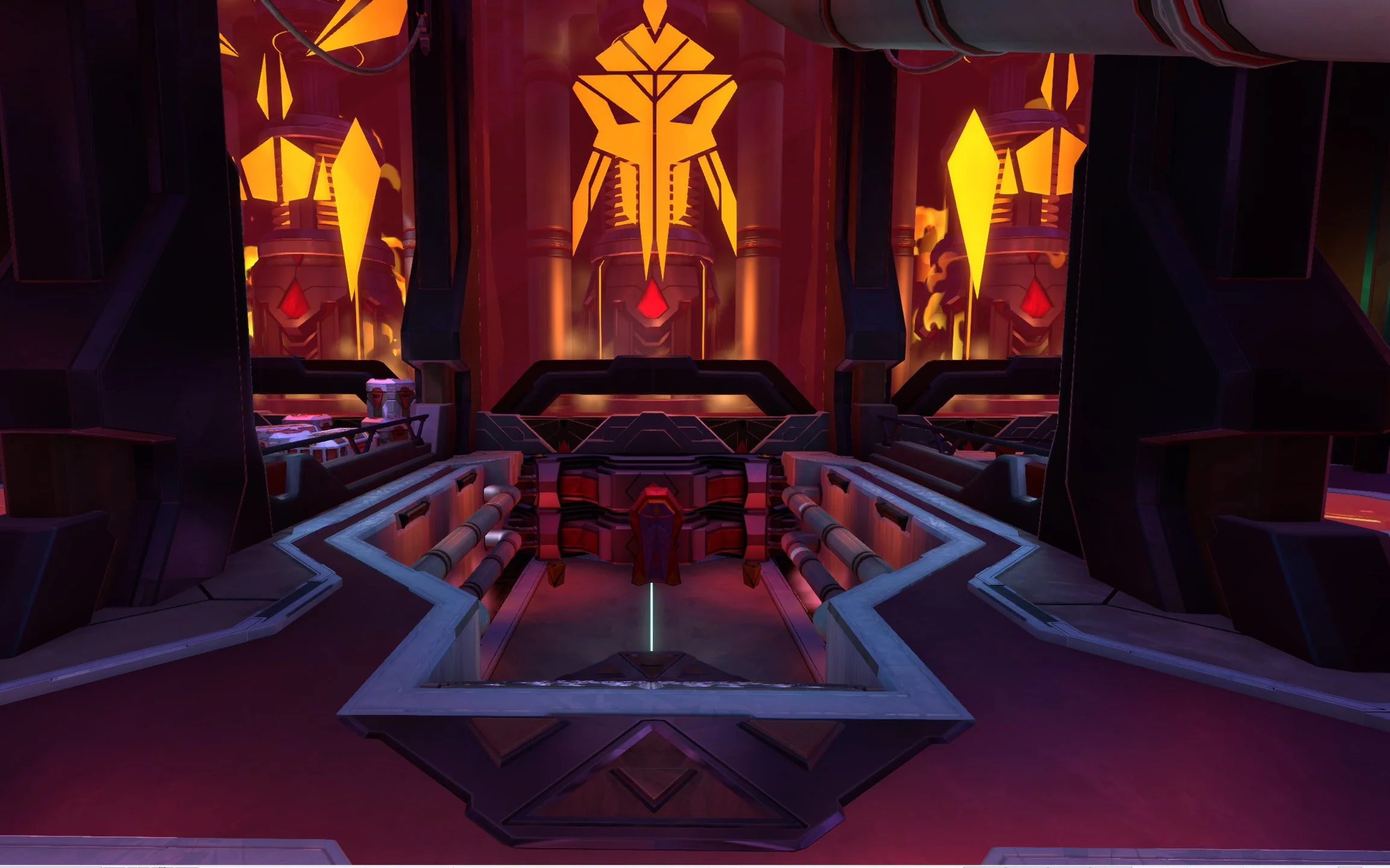
The first level I worked on was known as the “Refinery”. It was conceived as a nightmarishly dystopian series of factories, gathering, melting down, and of course, refining, strange crystalline minerals.
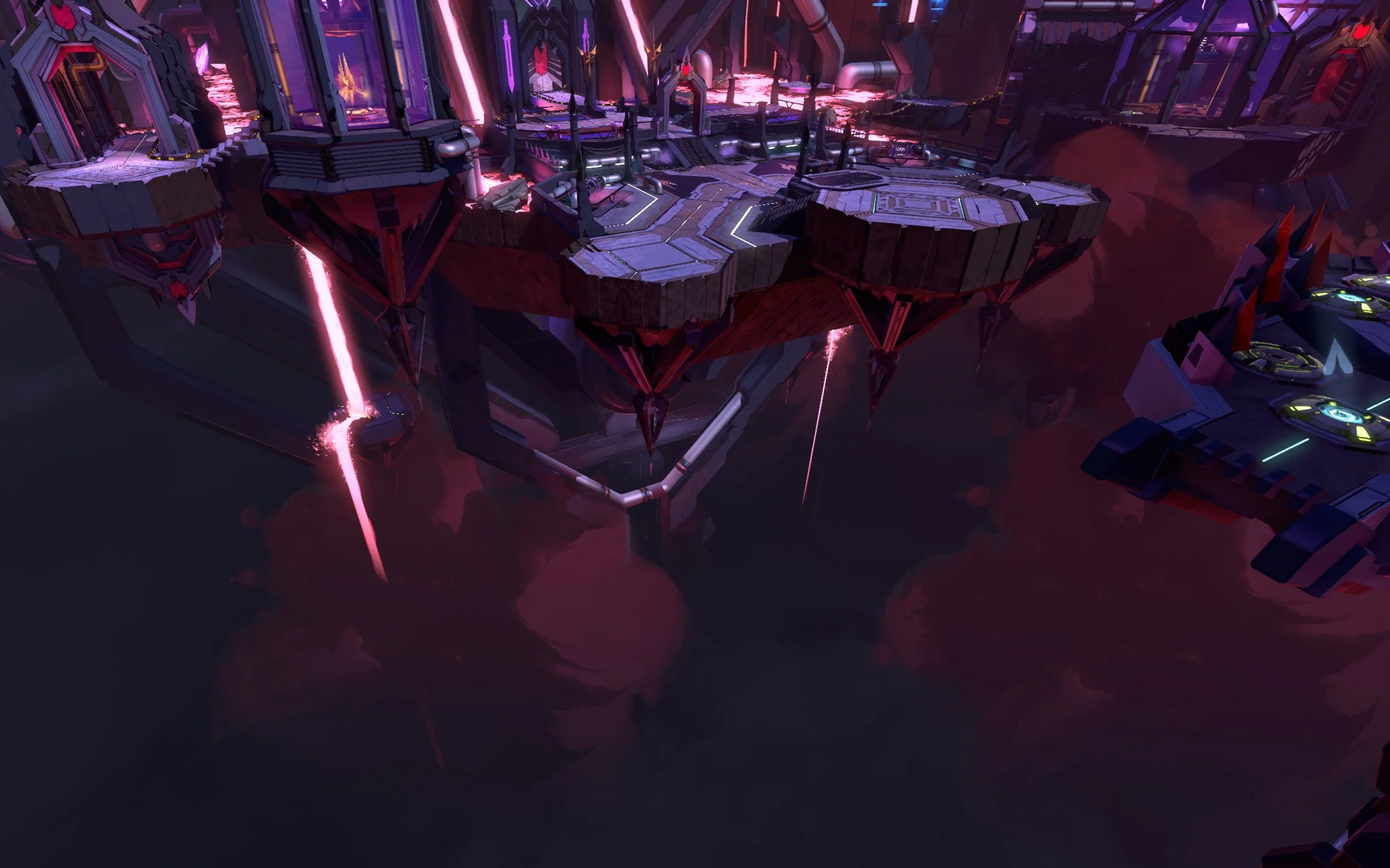
Each segment of the complex was housed on it’s own island connected by a series of jump pads that would launch players from location to location. Upon arrival players would be greeted with waves of defending enemies.
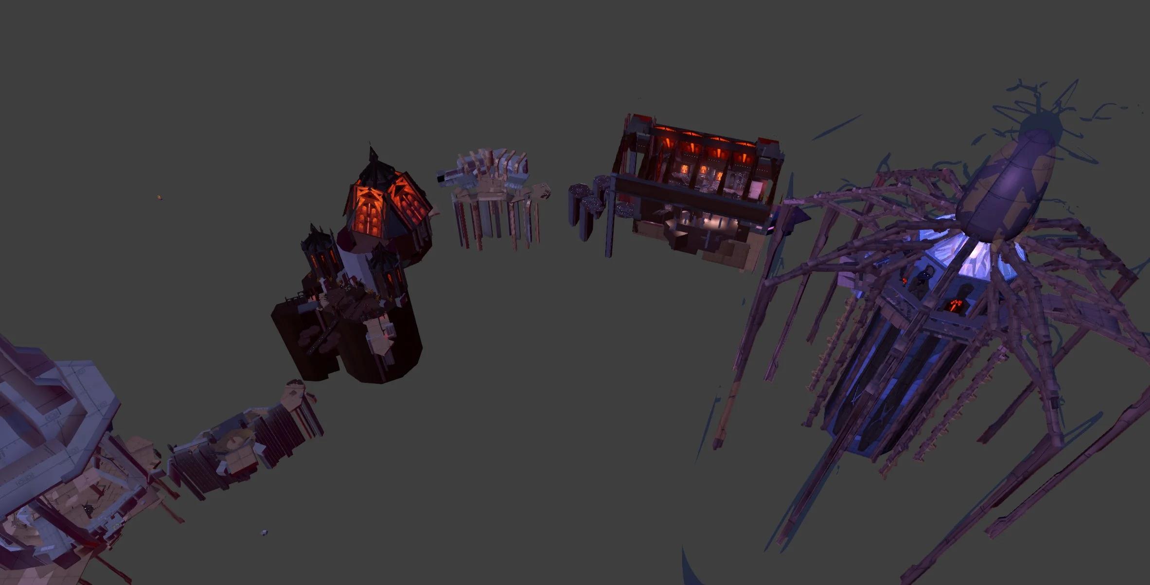
Below, you can see a shot of the level block-in I was given to start from. I felt that the current layout was a bit confusing without a clear idea to ground it. As well the space didn’t evolve much as players traveled from the sparse outskirts, to the final battle at the generator. Lastly, it was unclear to players what the purpose of each area was, and I wanted to strengthen the sense of place.
BLOCKOUT TO CONCEPT
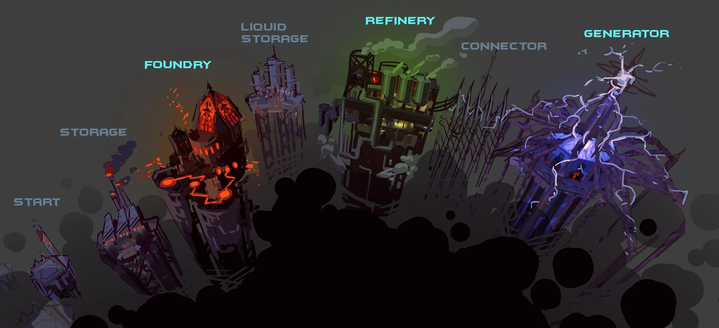
I began with a quick paint-over of the area. First identifying three main areas of focus such that players could get a clear sense of progression. I then rescaled the different segments in order of importance and invented real world themes I could use for inspiration. To bring everything together I imagined the buildings as epic spires poking out of an ocean of industrial smog.
VISUAL EFFECTS
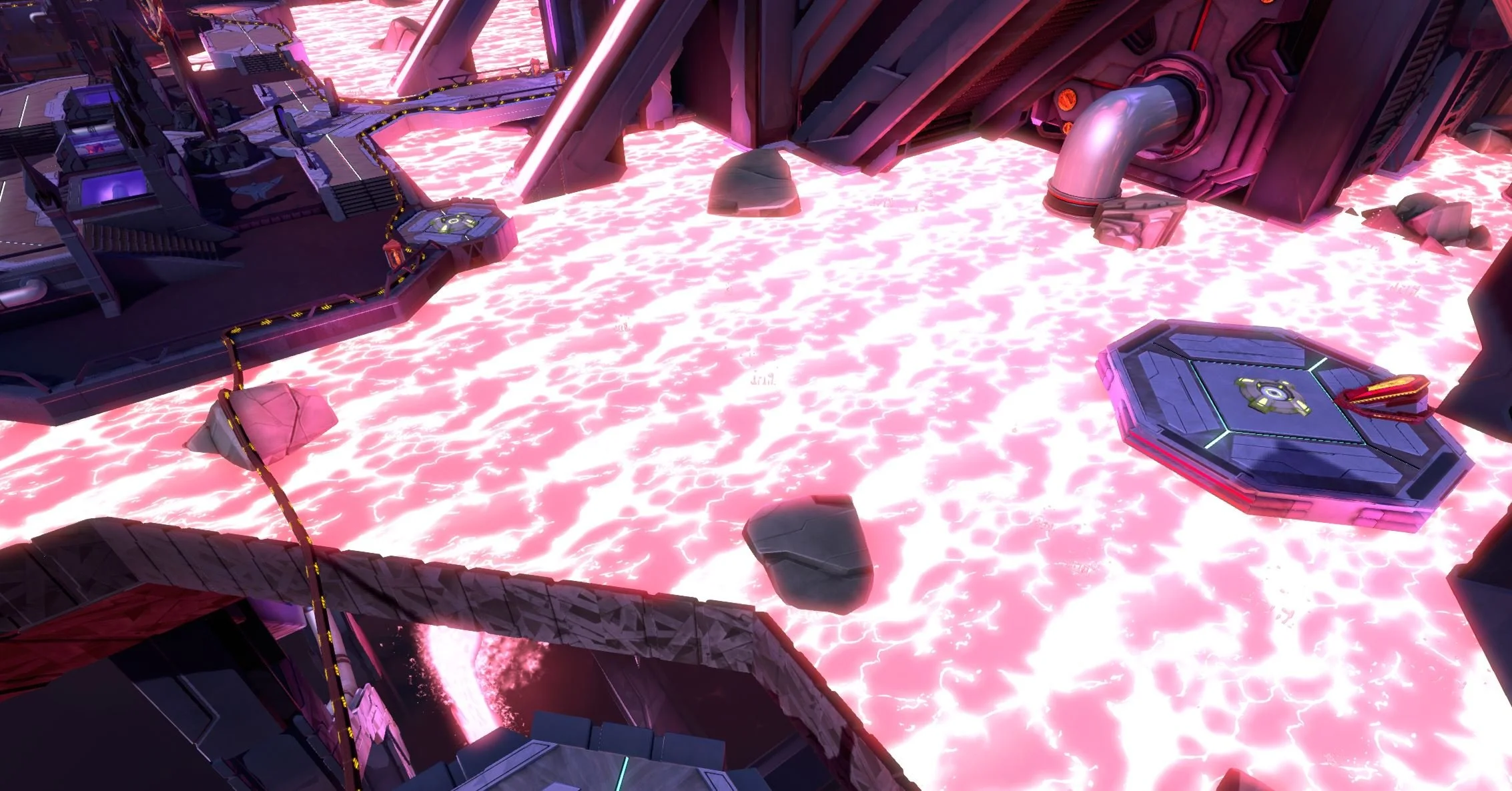
The lava effect that had been created for the initial art set didn’t feel like it was integrating well so I created a new version that used vertex painting to control the blending of several texture layers and material effects.
I then added a tessellated mesh and used an additional vertex channel to add height variation and seamlessly blend with the surrounding objects.
WALKTHROUGH
EPISODE 3
THE RENEGADE
The next area of the game I worked on was a symmetrical capture-point style multiplayer map. The layout was really solid and worked well in testing. This gave me extra time that I used to focus on theming the two sides of the map and making the routes and POIs as clear as possible.
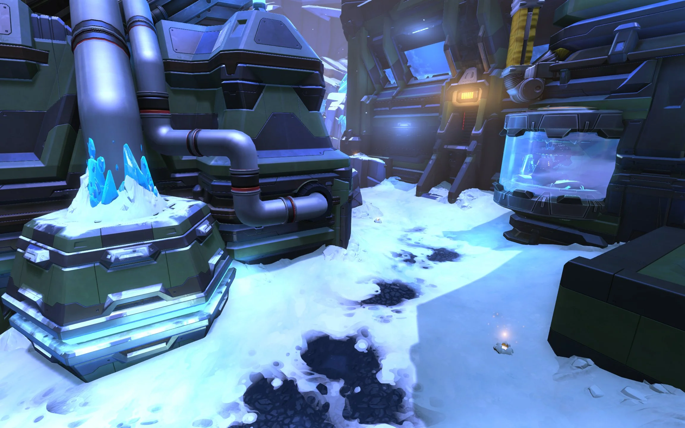
The art set for this environment was really flexible so I didn’t need to do much work there beyond making a few new terrain materials that allowed me to melt the snow and blend meshes seamlessly into the terrain.
CREATING A THEME
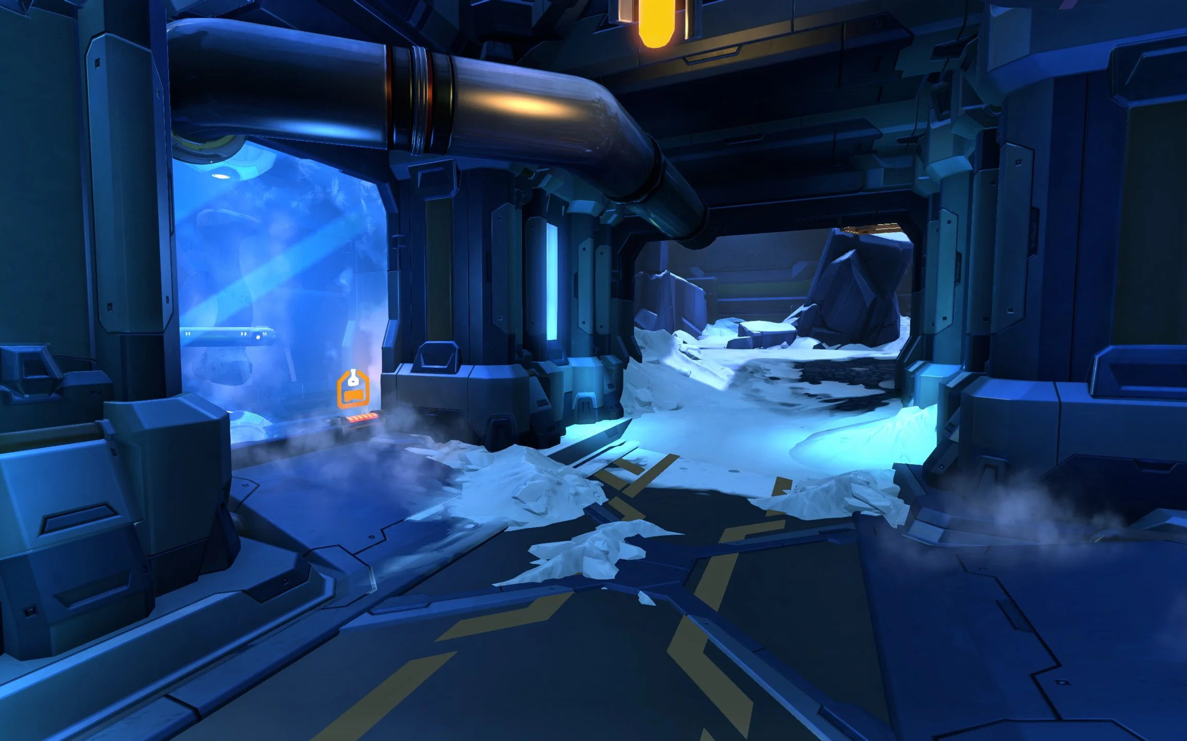
There wasn’t a strictly defined narrative defined for this level but one thing I noticed during playtests was that, in heavy combat, it was easy to get turned around and not know which side of the map you were on. Inspired by the snowy theme of the block out, I decided to create hot and cold sides of the level.
The primary tool used to communicate the temperature difference was a pair of custom postprocess volumes that split the level into warm and cool toned halves. This distinct color shift combined with analogous lights, deco elements, and particles made it clear, at a glance, where you were in the otherwise symmetrical level.
HOT ENERGY
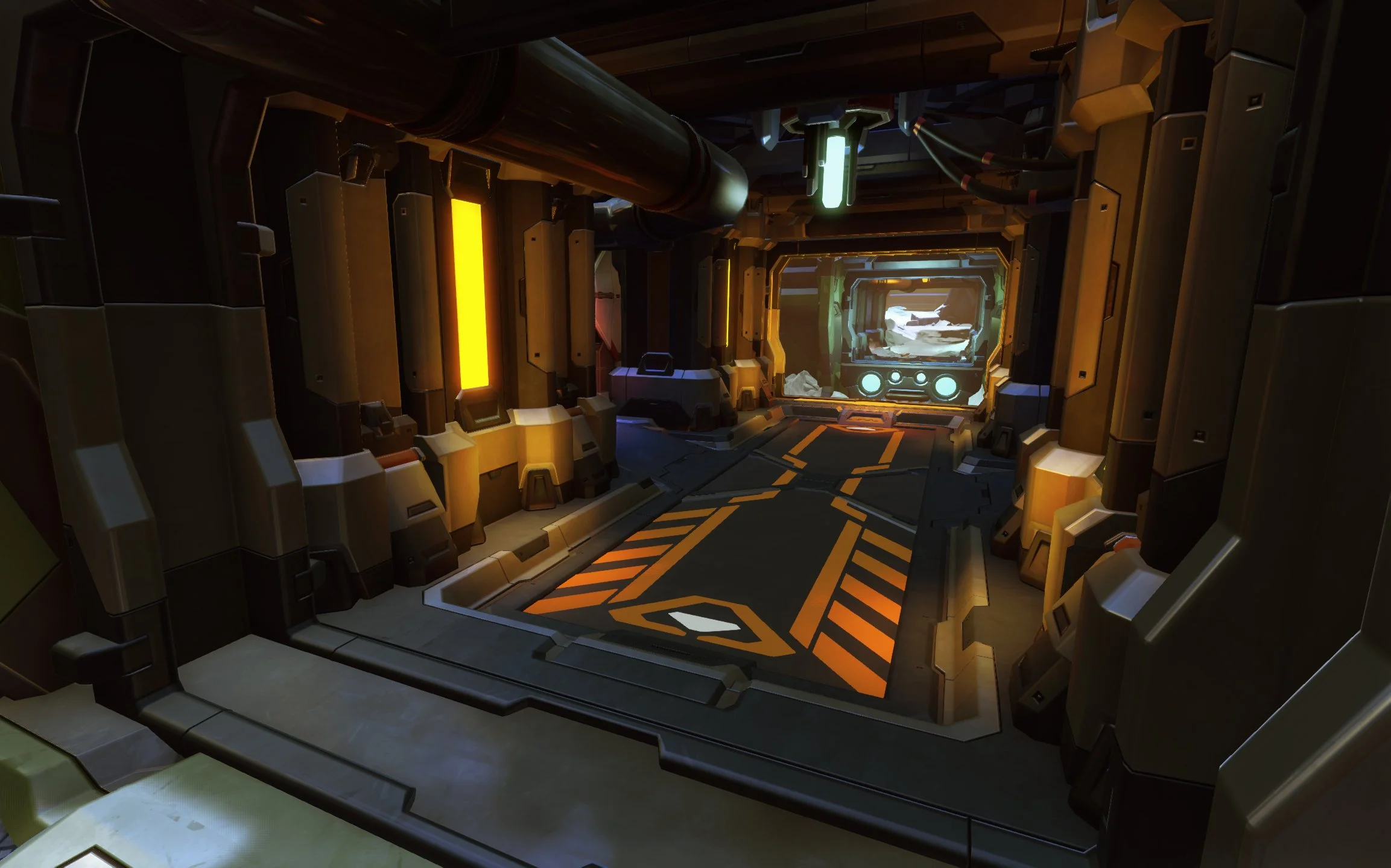
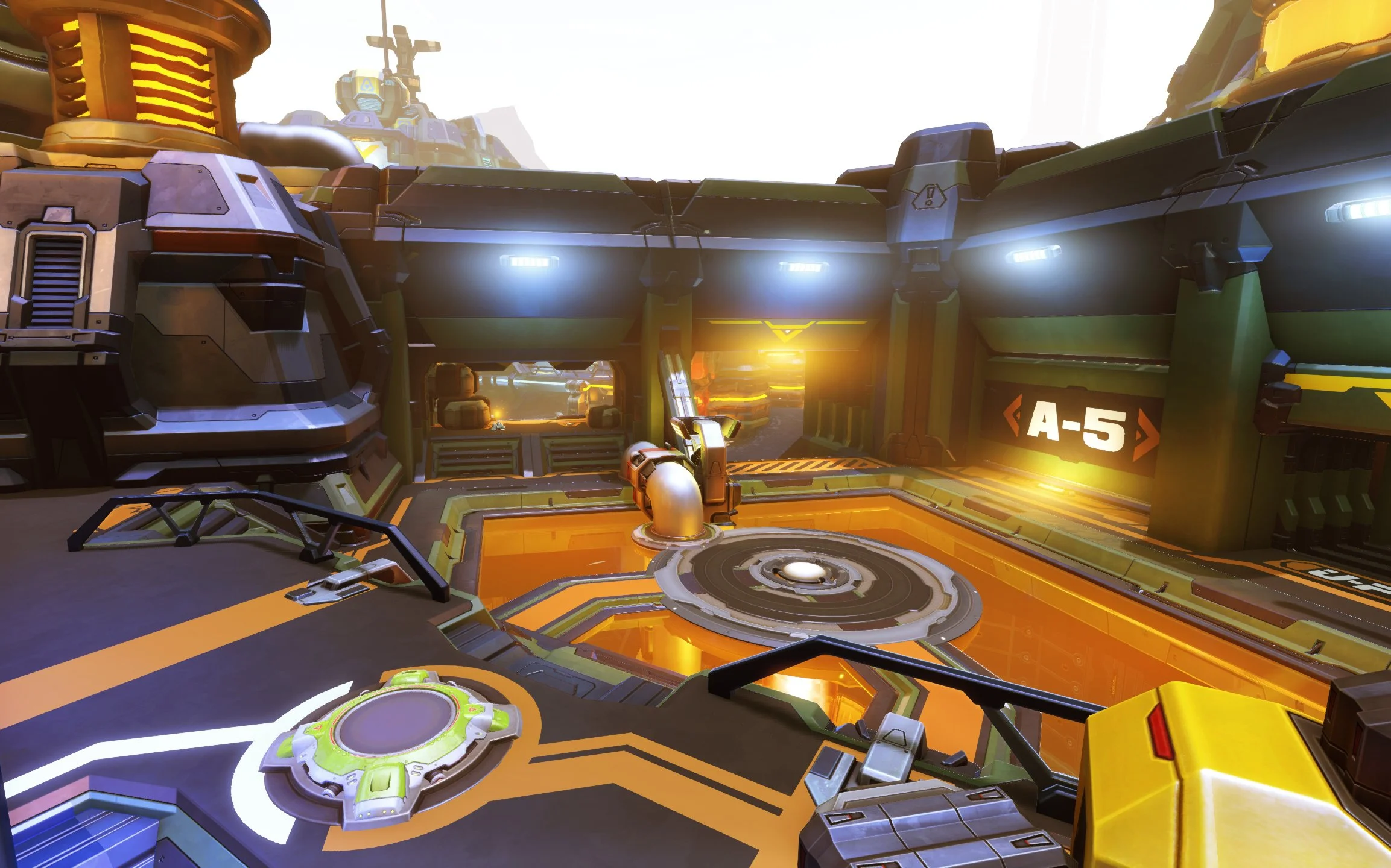
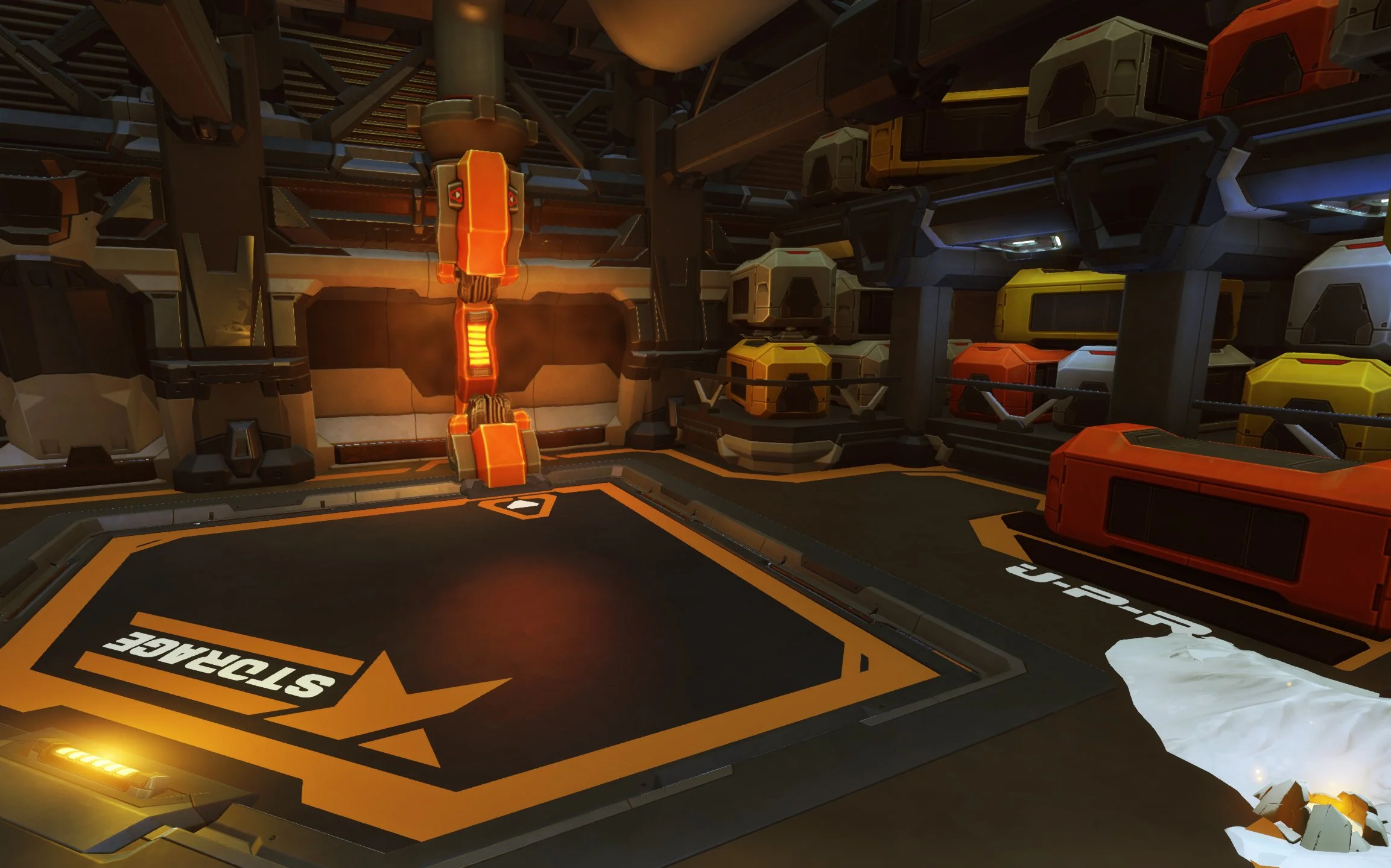
The hot side was themed around a thermal energy power plant. While there was some snow tucked into the corners, I melted the snow away across much of this side, creating power cores, heaters, and vents to reinforce the narrative.
I chose solid, squared off, forms on this side to make it feel industrial and defensive in contrast to the more aggressive cold side. I hoped to communicate that the people who worked on this side were more focused more on energy and defenses.
FRACTURED ICE
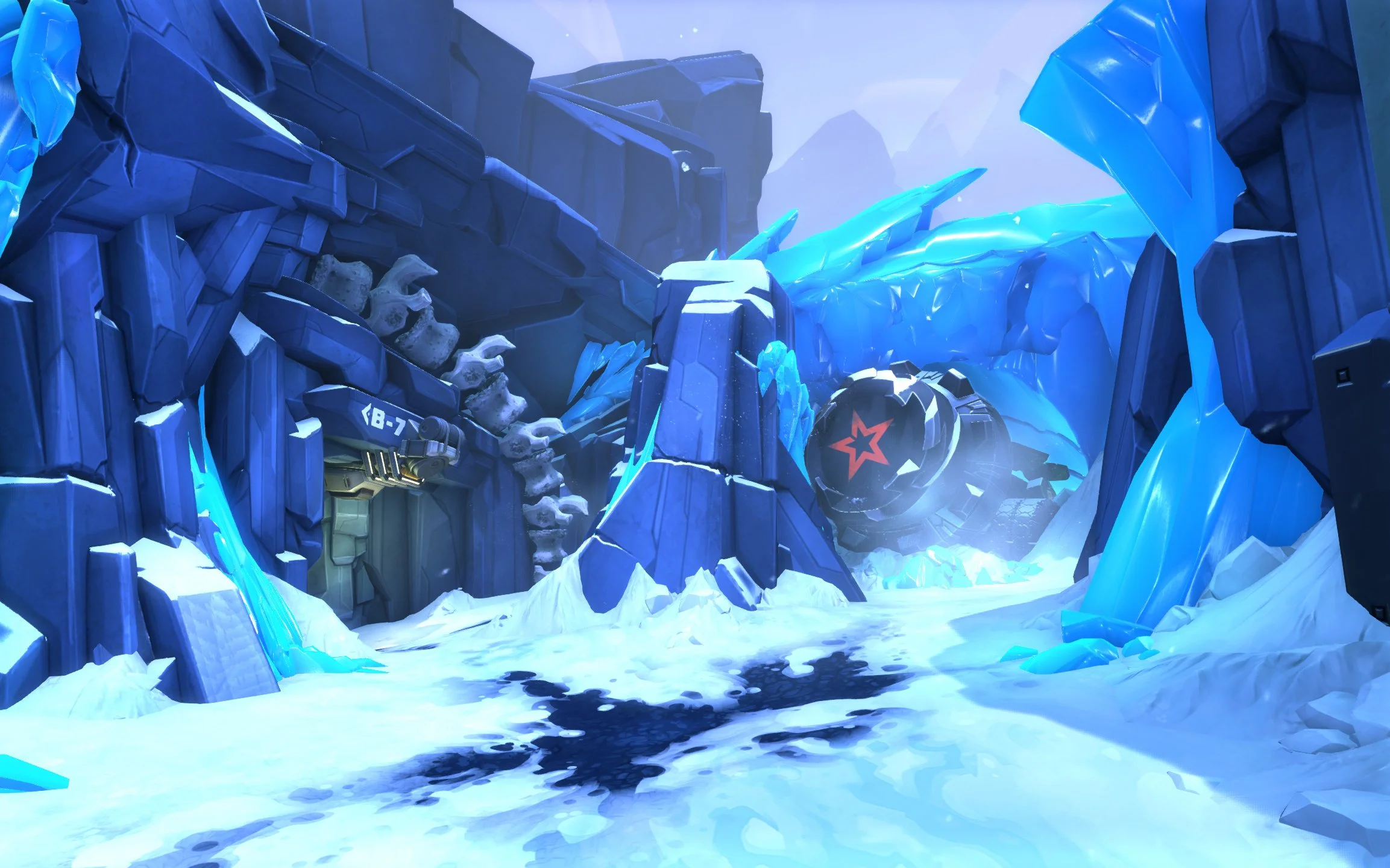
The cool side of the space was themed around excavation. Telling the story that this part of the complex was digging through solid ice.
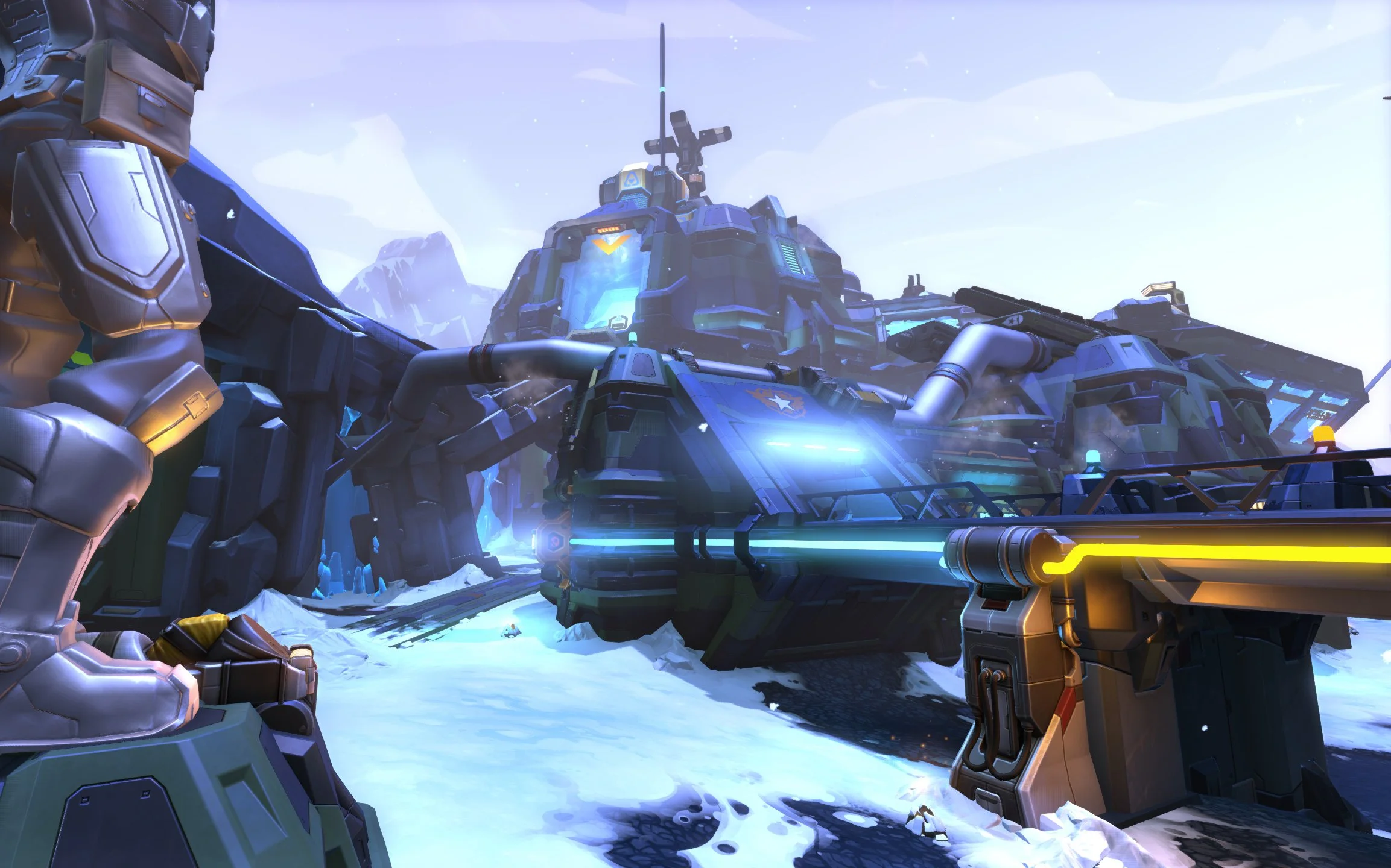
I used fractured lines, drill bits, ice spikes and other dynamic shapes to make this side feel sharp and aggressive. Deco throughout the area was cold themed with snow on the ground, ice, cool colored glass, and falling snow all reinforcing the sensation of cold.
WALKTHROUGH
VISUAL DESIGN
My main goals when working on this capture point were to create more clarity, and enhance the presence of important tactical locations.
Firstly I wanted to bring more focus to the capture point, but the layout was pretty solid in playtesting, so I didn't want to make any major structural changes. Instead I chose to make the floor transparent and installed a massive energy core underneath it. The bright orange floor created a natural focal point, reminded players which side of the level they were on, and anchored the rest of the space. As an added benefit the energy core made the capture point feel like it was worth capturing.
Next I increased the visibility and size of the crate on the upper-left platform. This was a critical piece of cover for defenders and I wanted it to stand out. A purple light behind the crate really made it pop and also added a bit more color range to the scene. Adding a railing with a gap in it, combined with the original staircase created a more defined flow for combat. Defenders could mostly focus on controlling the gap, and attackers with jumping skills could leap over the rail to attack from unexpected angles.
The final work was wrapping the forms of the floors and walls around the capture site to create harmony in the space, and keep players eyes on the objective.
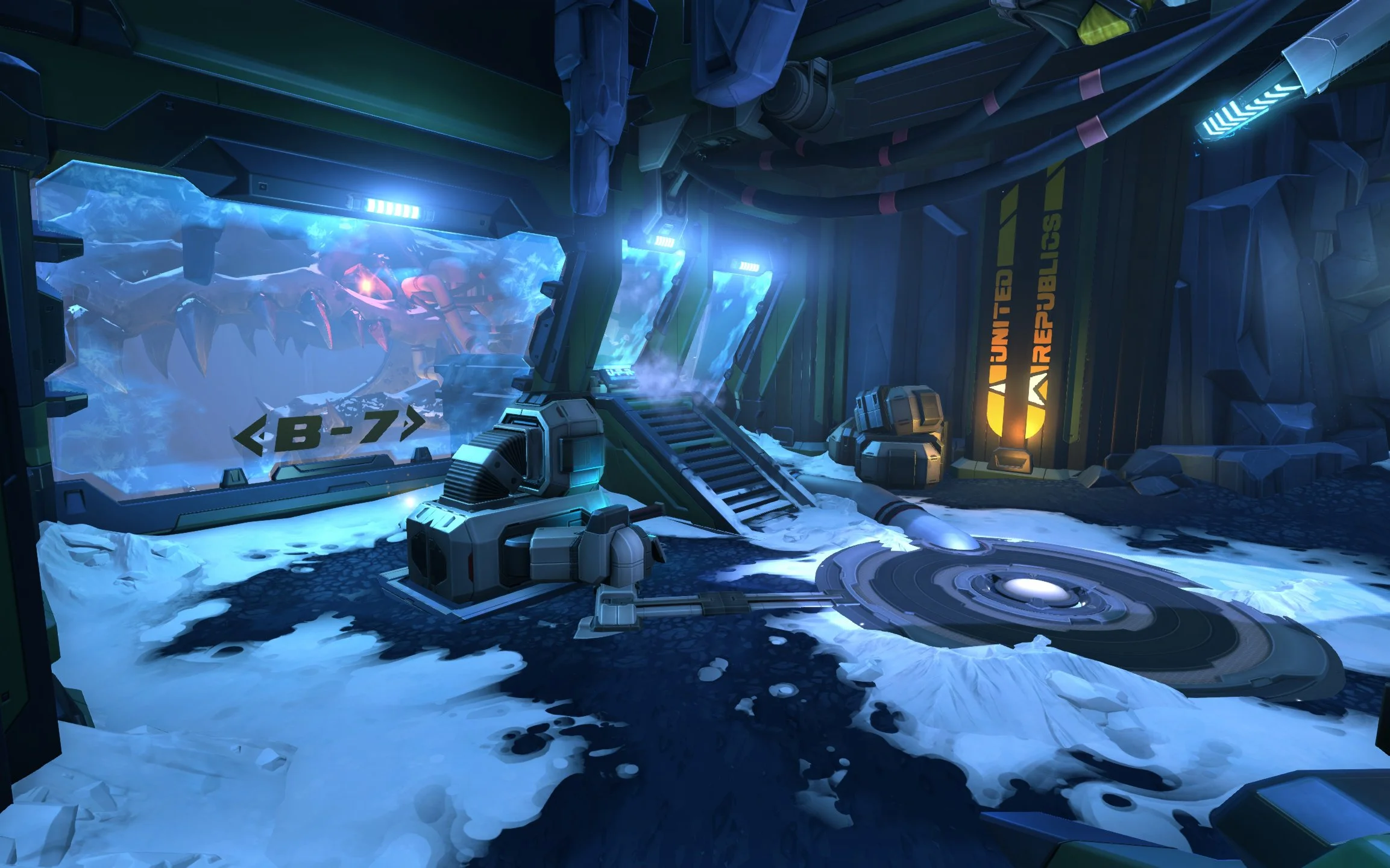
The primary challenge for the cold side capture point was visual interest. The space was functionally quite simple, with only a handful of cover locations, so again I used a transparent wall, in this case ice, to make the space feel larger.
I decided to lean into the idea that the cold side faction had been digging for ancient fossils. Adding the huge dragon head frozen in a solid block of ice, helped give this area a strong identity. I added pipes connecting the glowing red eye of the dragon to the capture point to sell the idea that it was drawing on some sort of ancient power source.
Since the cave had two exits I wanted players to be able to quickly recall the difference between them, so I added a brightly lit “United Republics” banner to one side of the room. This combined with the asymmetrical window layout helped players orient quickly.
When beginning the art out for this space my main goal was to improve the structure such that players could more clearly identify cover, pathways, and exits. Firstly I simplified the space, focusing on a central pillar with paths on either side leading to the Capture point.
Next I added a focal point to make the location more memorable. Consolidating most of the blue ice into a single wall and then kit bashing a digging machine bursting through it. This helped increase the energy in the scene, and adding a red star decal had the dual benefit of preventing color fatigue and leading players eyes to the edge of the pillar that might be hiding enemies.
When creating the ice wall, I wrapped it around the digger to create a large arrow to direct players attention to the nearby capture point. Adding some tech elements and lights to the doorframe helped make the entrance more clear as well. Finally I created an arch of bone around the door to reinforce the story that people here were conducting some sort of archeological dig.

